Categories: branding / typeface
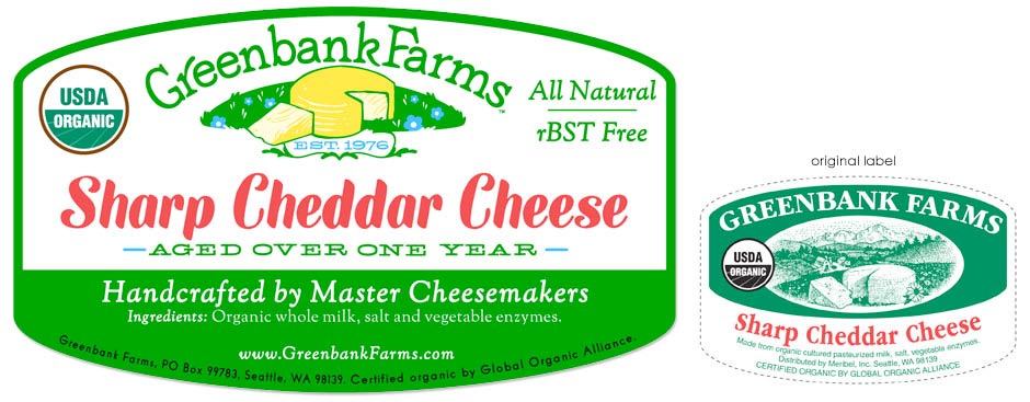
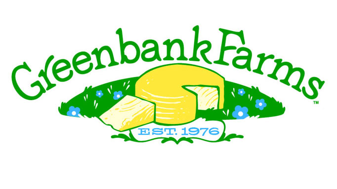
Redesigned logo and packaging for Greenbank Farms. The brief called for an updated logo to replace the original that had been in use for almost 30 years and give the “everyday” cheese an upscale look. The older logo varied across cheese labels and the designs were inconsistent throughout. The new logo reflects the heritage of the brand’s history, condensing the complex illustration into an iconic image of a cheese wheel laying in a fresh green pasture. The typeface was handlettered & customized from a soft, rounded font to give it a homey feel.
A customized font for the cheese labels was also created for the cheese type displayed. A system of label templates was devised for the different cheeses the brand offered.
click images below to view details